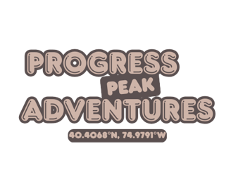
Progress Peak- Adventure with pride
About Our Logos!
Learn more about the iterations of our logo and what they mean!
HISTORY
Carson E.
4/13/20252 min read
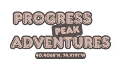
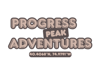
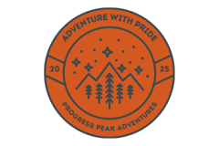
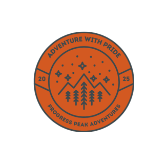
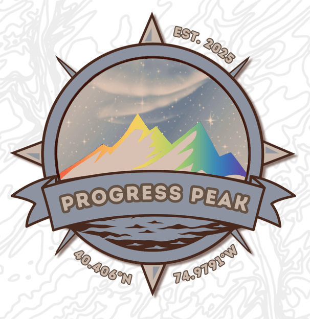
Main Logo (2025)
Features of our Current Logo:
The name "Progress Peak Adventures" comes from the premise of the progress flag, indicating inclusivity and that we are an LGBTQ+-owned organization. The rainbow peaks on the mountains inside the logo are also for LGBTQ+ pride.
The logo is bordered by a compass, indicating that we will navigate the world together.
Under the "Progress Peak" banner, is water, showing that we will prevail in all environments.
The compass coordinates take us to Stockton, NJ where our founder grew up to value nature and the outdoors. In addition, the topographical pattern behind the logo is a rough iteration of the map of the Delaware River between Stockton, NJ, and Solebury Township, PA.
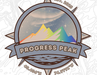


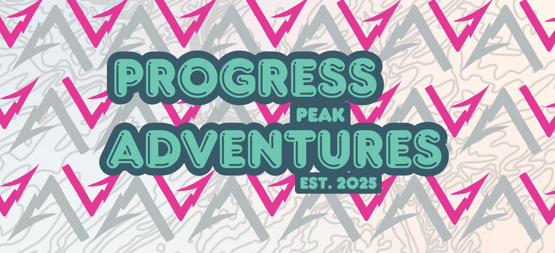
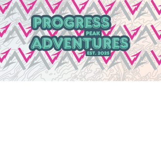
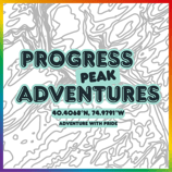
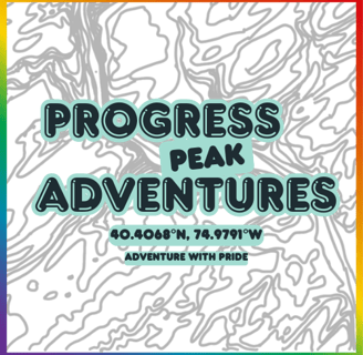
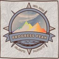
Other Logos
Occasionally, we use the following logos for Progress Peak!